

Growing a design system with
Roles
UI/UX Design
UX Research
Copywriting
Platforms
All
Years
2019-2024
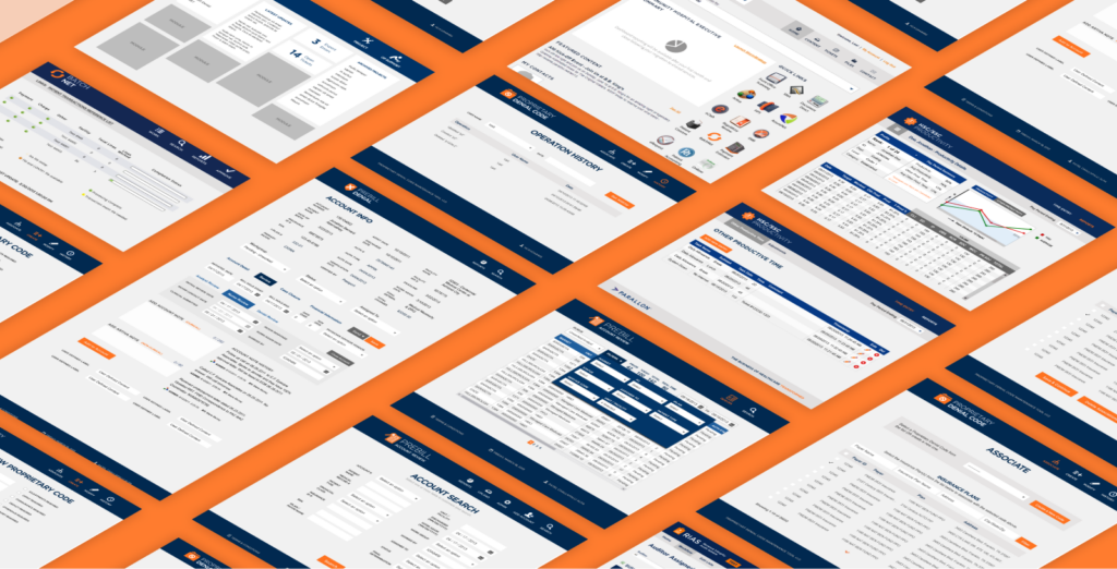
Establishing and scaling the Nstyle Design System has taught me many things. Deployed across 14 products, it has been restructured, replatformed, and become the cornerstone of development autonomy at the organization.
Starting Small
Nstyle started with a UI kit and kitchen sink page approach – the most pressing problems for design was staying consistent with each other when moving quickly, while the biggest headache for development was cleaning up the many CSS conflicts that were popping up in the production environment.
We started a UI Kit in Sketch that compiled the new UI elements used to design Ncomply into one central location. Instead of developers copy-and-pasting code from one project to the next, a ‘common UI’ page with all UI elements on it was spun up for the newest of 3 codebases, and before long grew into its own GitHub project.
Lesson: “Useful” Happens When You Listen
Good developers are more than happy to give feedback if you ask. By surveying the Engineering team & asking what components would save them the most time if they were standardized, we were able to stack-rank the components and add them to the common UI project in order of most helpful.
Scaling with the Team
We quickly ran into the issue of needing to extend the system standards beyond the first codebase, in a platform agnostic way. Being 2019, Sketch and InVision were part of all project workflows, so we built our first version of written documentation and redlines in InVision’s DSM.
The team continued to grow, the design team transitioned to Figma, and we quickly found that the DSM platform didn’t offer the ability to add code samples or tie in to Figma. After trialing several platforms, we re-platformed the documentation with Zeroheight and immediately more people could help and additions could be made more quickly.
Lesson: Consistency Moves the Needle
Many designers and developers gave their time and effort towards making it what it is today. Even though we never had a dedicated headcount to build the resource, we held regular “swarm day” events to get the most important backlog items knocked out.
Lesson: Adoption Doesn’t Happen by Accident
While evangelizing the merits of the Design System is important, I learned that it is much more effective to create conditions where it is easier to use standard components than it is to create your own. We did this on the design side with having a library of drag-and-drop Figma components and on the dev side with easy-to-understand Storybook documentation.
Scaling with the Org
Once a Design System is established, I learned you have to be intentional with evolving your standards through customer feedback.
In one study we learned that a decent portion of customers were seasonal users because their compliance obligations only happened twice per year. Being less familiar with the tools and what has changed in the 6 months since they last logged in, they wanted visible labels beside any icon buttons… even if that meant they had less actions visible to them at once.
After that study, we started rolling out text labels for all buttons …and NPS feedback from Pendo and reduction in rage-clicks registered in FullStory affirmed that was the right choice. How customers feel about patterns that are prevalent in your products is crucial to having happy customers and fully-adopted products.
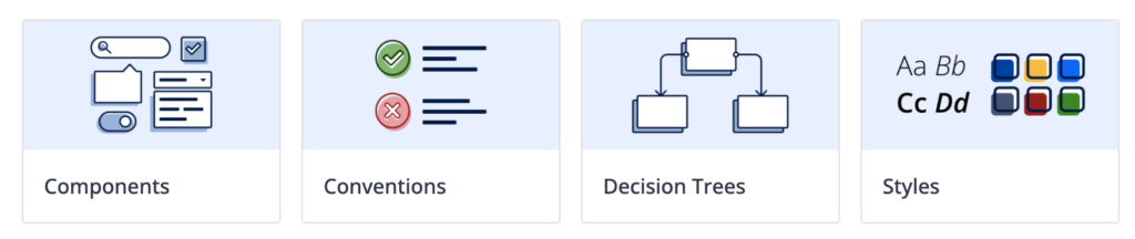
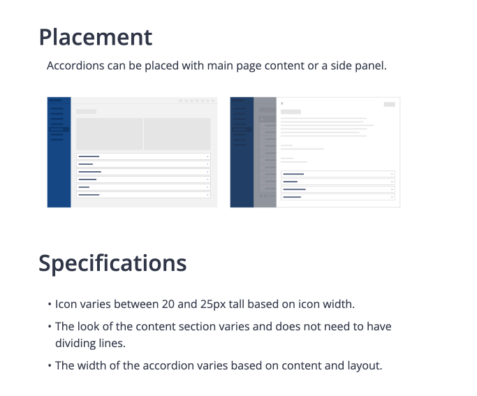
Conventions & Interactions
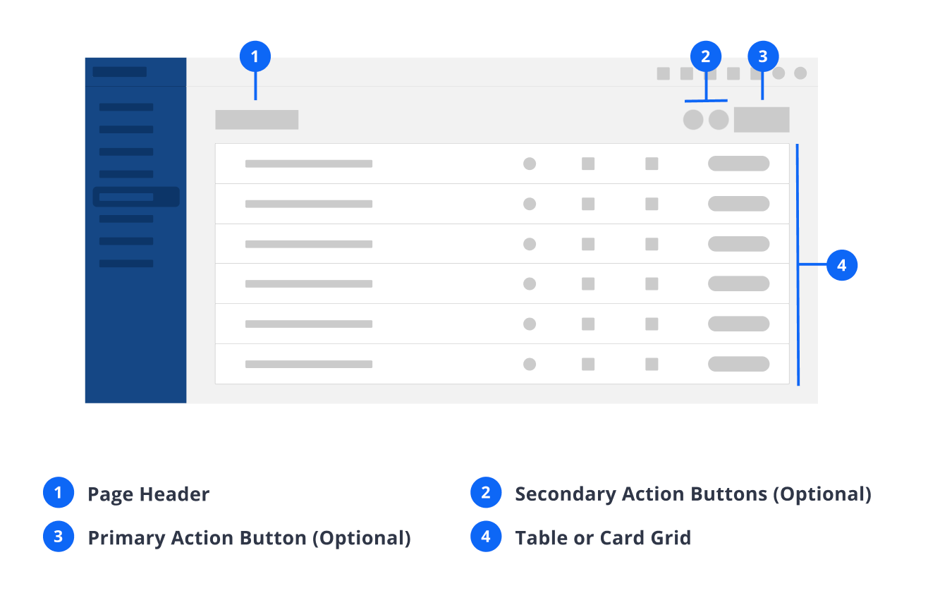

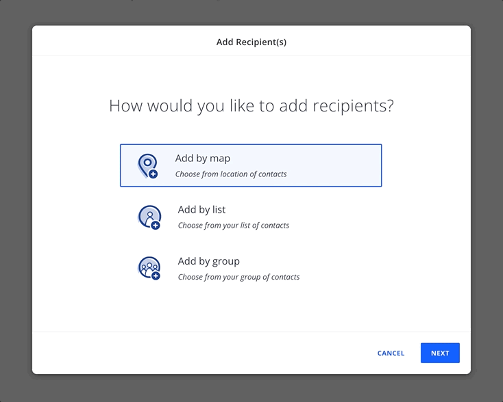
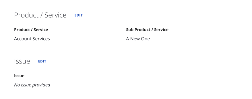

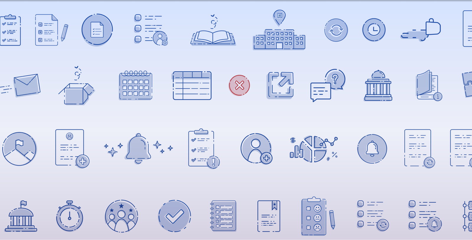
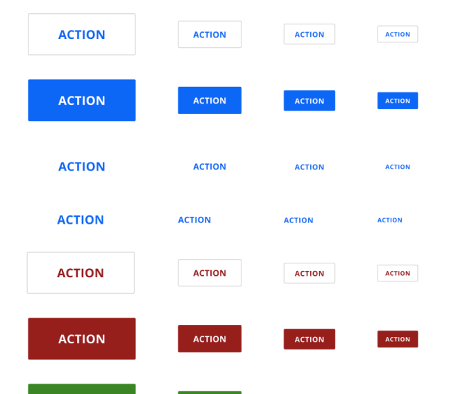
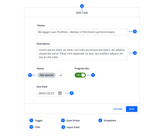
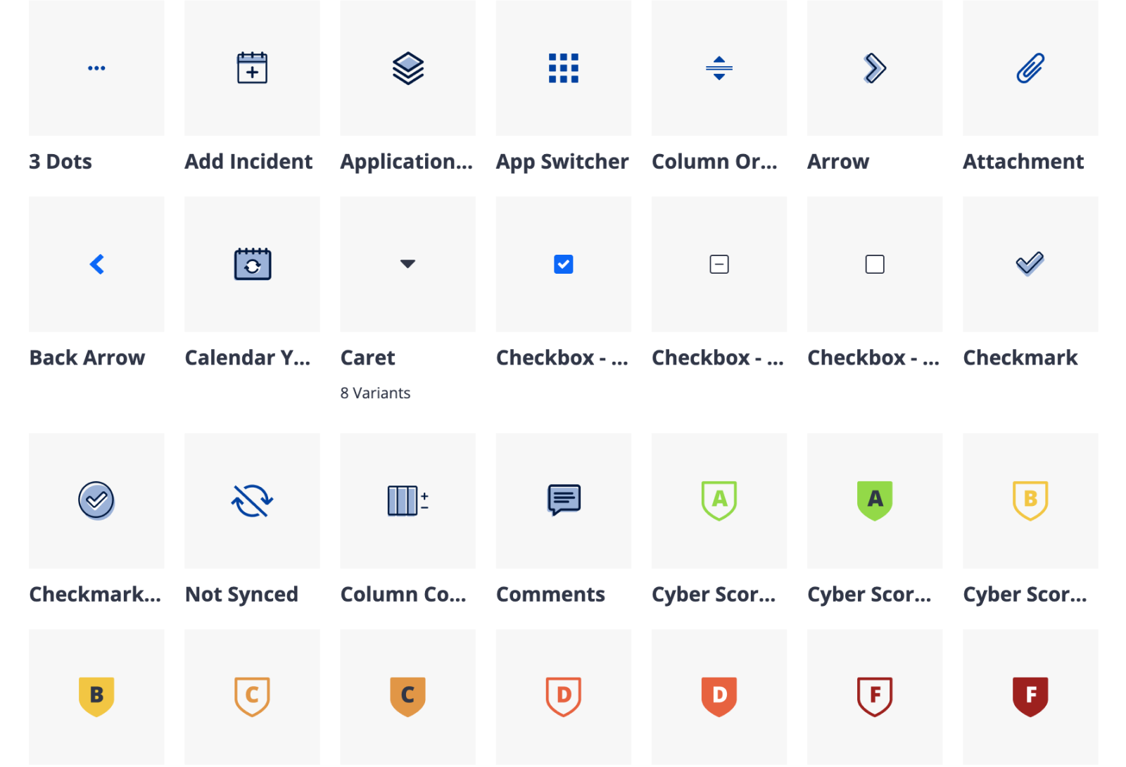
Components
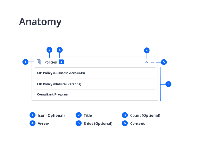
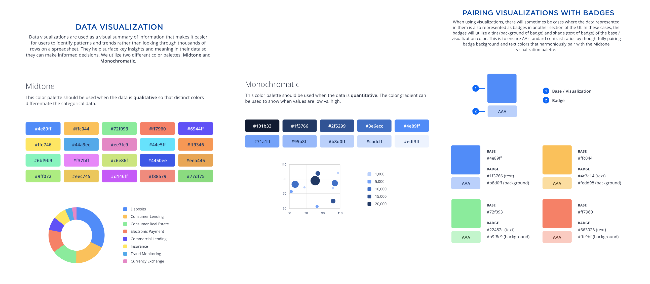
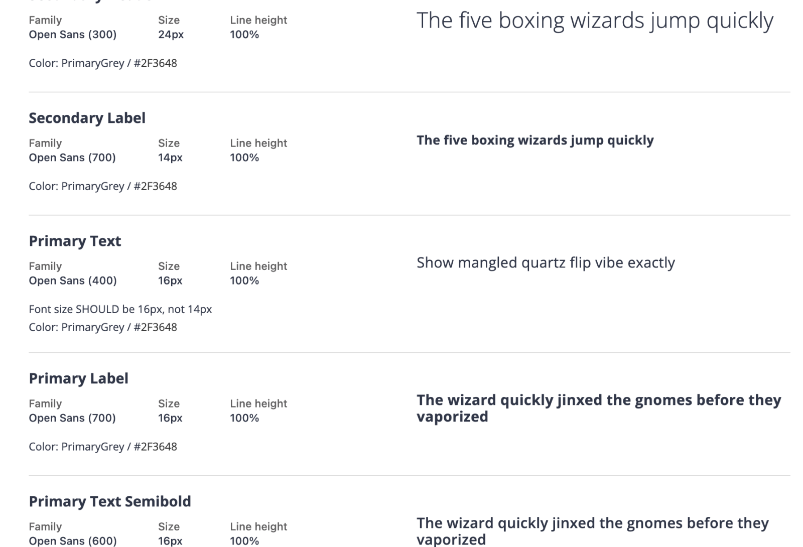
Color Pairings, Imagery, and Typography
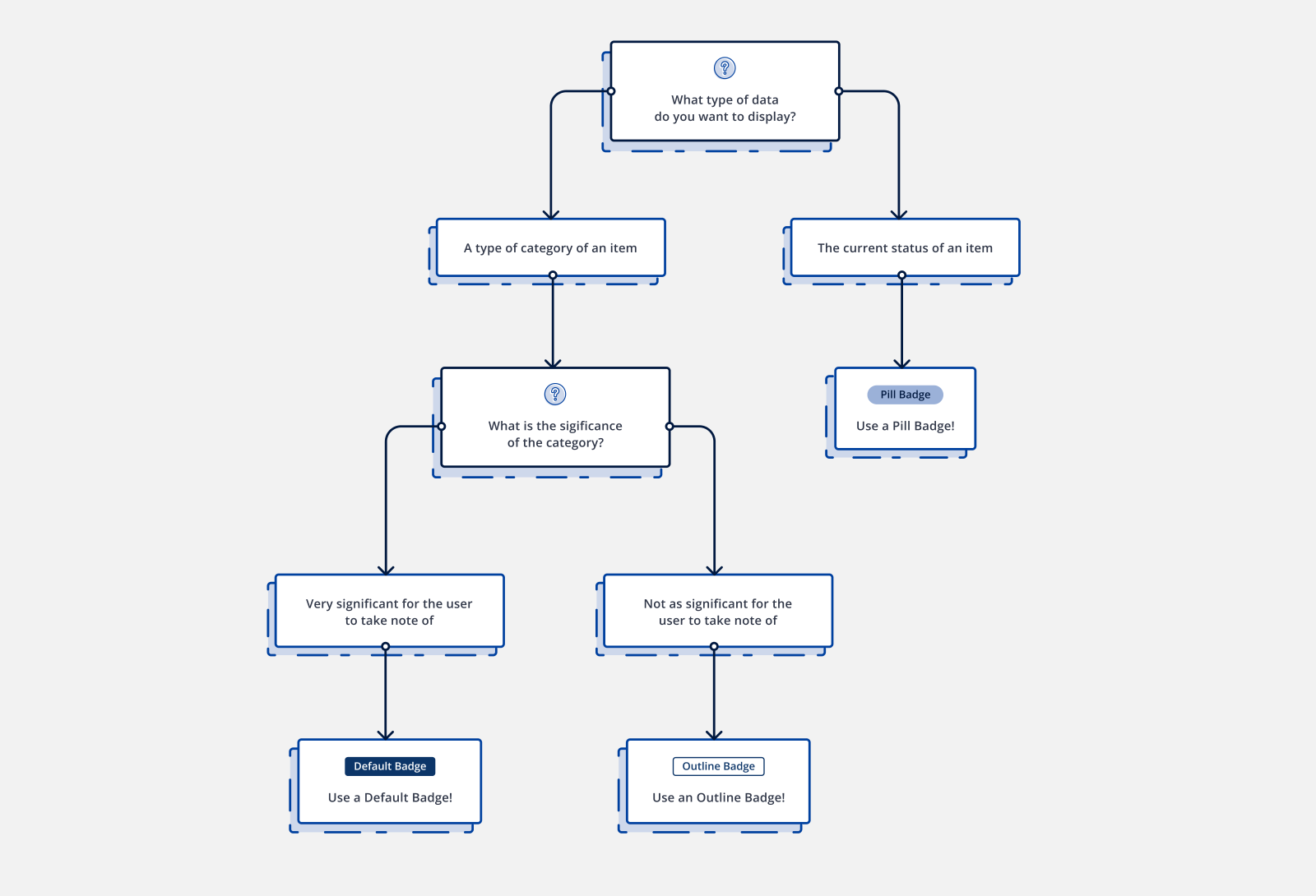
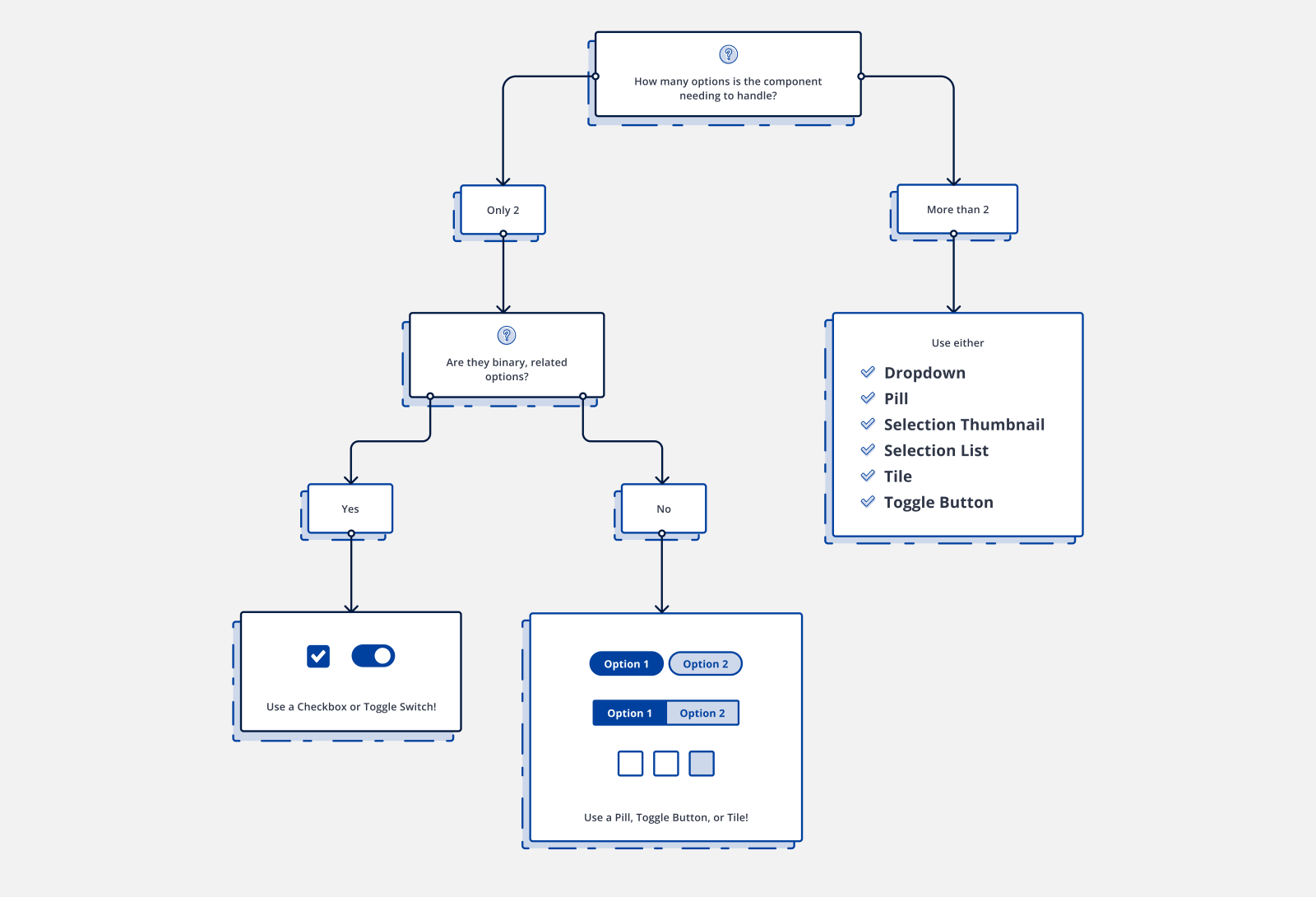
Decision Trees
To see the full system, visit nstyle.ncontracts.com.
Other design system / style guide work