Working backwards from what’s already built to crystalize BrightGauge’s brand expression
Roles
UI/UX Design
UX Research
Platforms
Desktop
Tablet
TV
Years
2015
Problem
The BrightGauge data visualization platform was built by a core team of developers over the span of a few years. The product helps teams of managed service providers understand how they’re performing with data from numerous platforms unified in one dashboard.
Like with any product that is constantly under development, standards had drifted from what was in their brand guide. While things were mostly cohesive, zooming in to the details, spacing was all over the place and there were dozens of values being used for the core colors of grey and green.
The team wasn’t sure what the actual standards were supposed to be and without clear guidance, devs were left to pick values they felt were right.
Research & Discovery
Taking a collaborative approach, I spent several days sitting paired with the front-end dev lead. We went through each section of the product and noted areas and elements that shared values and areas that clashed or were just a few pixels off.
Together we decided on standards with the criteria that they were the most prevalent, they worked with the grid system that’s already in place, and standardization wouldn’t require completely restructuring the HTML of the app.
My notes ended up pulling double duty as both my guide for creating the design system documentation AND the JIRA backlog of everywhere that needed to be updated to be compliant.
Solution
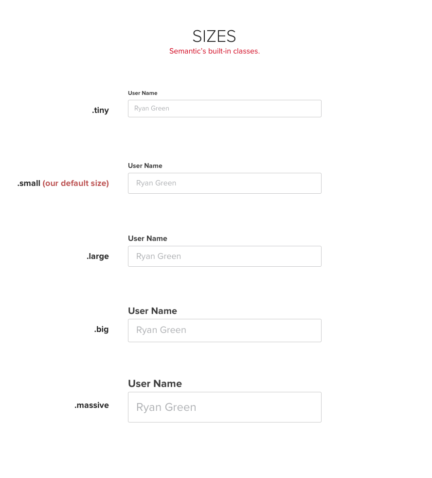
I created redline documents for each of the different component areas, calling out SASS variables where appropriate. I made a clickable HTML version as well that the devs bookmarked to reference whenever in doubt.


Results
The decisions made were practical, the dev team didn’t have to guess any more, and over the span of the next several weeks the UI cleanup was completed. The product felt more polished – a few customers even messaged us on Twitter, noticing the changes towards cohesion!

